Every designer begins with enthusiasm, ideas, and a desire to create something new. But what truly builds skill is consistent practice, and that practice doesn’t always require starting from scratch. One of the most powerful yet underrated methods to improve as a design student is redesigning existing work.
Redesigning helps you understand the “why” behind visual decisions, trains your eye to notice details you once ignored, and accelerates your growth far more quickly than creating fresh concepts every time. This blog explores why redesigning is such a strong learning tool and how it can help students refine their craft, strengthen their portfolios, and think like professional designers.
I. Sharpen Your Eye for Design Flaws
Great designers are also great problem-solvers. Before you can improve something, you need to recognise what’s wrong with it. Redesigning teaches you exactly that. When you evaluate an existing visual, be it a poster, menu, flyer, or social post, you learn to identify issues such as clutter, misalignment, poor color choices, inconsistent spacing, and weak hierarchy. The more you redesign, the faster your eye becomes at diagnosing flaws.

Event posters often suffer from information overload, too many fonts, tight spacing, random icons, and no clear message. As a redesign exercise, students can try taking any busy event poster from their campus and simplifying it. Reduce the number of fonts, create a clear visual hierarchy, add breathing space around the important details, and use colors that match the event theme. By doing this, you’ll start learning to separate what’s important from what’s unnecessary, building stronger visual discipline and clarity with every redesign.
II. Prepares You for Real Client Challenges
In the professional world, designers rarely get a blank canvas. More often, they’re asked to improve what already exists, a brochure needing an update, a UI screen requiring better flow, or packaging that feels outdated. Redesigning prepares you for this reality by teaching you how to work under constraints. You learn to think strategically: What must stay? What can change? How do I elevate this visual without losing its identity?
Think of a neighbourhood bakery still using an old, dull flyer with blurry photos, uneven spacing, and colours that feel dated. As a practice task, students can choose any such local flyer and challenge themselves to redesign it. Instead of touching the logo, focus on elevating everything else. Swap in crisp visuals, reorganise the layout so it feels clean and readable, and choose a colour palette that feels warm and modern. Exercises like this train you to improve existing materials while working within boundaries, a core skill every professional designer needs.
III. Let’s You Focus on What Matters Most in Design
A major challenge for students is spending too much time creating content, writing copy, choosing images, or inventing concepts. Redesigning removes this pressure so you can focus entirely on design fundamentals like layout, visual hierarchy, spacing, and readability. These foundational skills improve faster when you’re not also busy thinking of the message.

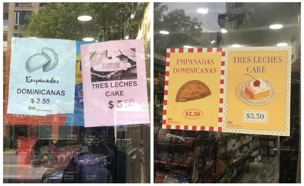
Many restaurant menus feel cluttered, with too many fonts, messy spacing, misaligned prices, and backgrounds that make the text hard to read. You can pick any confusing menu (online or from a local café) and give it a clean, modern structure. Use a single font family, align the prices in a clear column, separate sections with consistent spacing, and choose simple colours that improve readability. This kind of practice helps you turn something chaotic into a design that’s functional, attractive, and easy to navigate, one of the most essential skills in graphic design.
IV. Adds Depth and Impact to Your Portfolio
Recruiters don’t want to see only beautiful final designs; they want to see how you got there. Redesign projects let you showcase impressive before-and-after transformations that communicate your thought process, problem-solving ability, and visual decision-making skills. A single strong redesign can demonstrate more skill than multiple isolated artworks.
Consider redesigning the packaging for a soap brand from the early 2000s. The original might include loud colors, a busy layout, and outdated typography. Your redesign could feature modern minimalism, a fresh color palette, cleaner type, and improved structure. The transformation tells a story about your creativity, your understanding of trends, and your ability to bring a product visually into the present era.
V. Learn How Trends Shift Over Time
Redesigning outdated visuals is one of the best ways to understand what makes design feel premium and modern. As you adjust colors, typography, spacing, and imagery, you naturally absorb today’s design language, minimalism, intentional white space, bold type, clean grids, and refined palettes. You begin to recognise how trends evolve and how to apply them thoughtfully.
Many old-school ads, especially from the ’90s, are packed with heavy gradients, random drop shadows, too many fonts, and layouts overflowing with elements. As a fun redesign task, students can pick any outdated ad and reimagine it for today’s aesthetic. Strip away the clutter, use clean and modern typography, emphasise the core message, and create breathing room with balanced negative space. This exercise helps you understand what makes a design feel current and teaches you how to transform outdated visuals into something fresh and relevant for modern audiences.
At ARCH, students are encouraged to move beyond basic assignments and truly immerse themselves in the creative process. They get opportunities to experiment with redesign challenges, take part in hands-on projects, and engage in specialised creative programmes that help them question, refine, and elevate their ideas. This approach pushes them to think deeper, explore multiple solutions, and develop a stronger design mindset—skills that prepare them for real-world design careers.
If you’re an aspiring designer, take the first step and join us today!