The way a product is packaged can spark curiosity, build excitement, and often become the reason a customer decides to buy it. We’ve all been there — drawn to a product simply because it felt right in our hands, or hitting ‘Add to Cart’ because the packaging just spoke to us. That magnetic pull isn’t random — it’s the result of intentional, strategic design rooted deeply in human psychology.
For design students, mastering this art goes beyond making things look good. It’s about understanding the invisible cues that spark emotion, build trust, and ultimately, drive buying decisions. Learning to decode and leverage these subtle signals can transform your work from simply attractive to truly irresistible.
In this blog, we’ll break down the key psychological tricks that will help you sharpen your instincts and create designs that don’t just look good but sell.
1. Color Triggers Emotion
Colors are the fastest way to communicate a feeling. Red can create urgency, blue evokes trust, green suggests eco-friendliness, and gold or black can signal luxury. Think about your target audience and what you want them to feel in the first three seconds of seeing the package. That color choice could be the difference between a scroll-by and a sale.
Different cultures may also interpret colors differently. In India, red represents celebration, while in some Western cultures, it may symbolize danger. Always consider cultural context when choosing your palette. This makes your design not just visually appealing but also contextually smart.
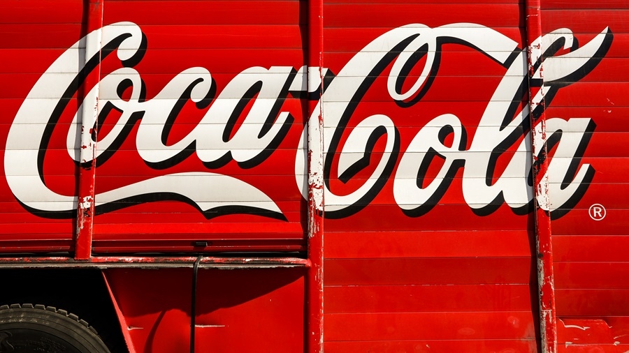
Coca-Cola’s iconic red isn’t just bold – it’s associated with excitement and energy. In contrast, Tiffany & Co.’s soft blue box speaks of calm luxury and exclusivity.
2. Typography Talks Personality
Fonts aren’t just about readability – they carry personality. A handwritten script might feel personal and artisanal, while a bold sans-serif font feels modern and bold. Choose typefaces that align with the product’s identity. Are you designing for children, health-conscious adults, or tech-savvy teens? Let the type talk.
Also, think about hierarchy and clarity. A good packaging layout ensures that the most important information, like product name, benefits, or usage, is easy to spot. Typography can guide the customer’s eye in a logical, pleasant flow.
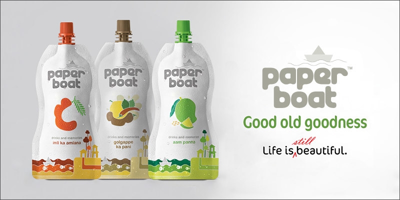
Brands like Paper Boat use nostalgic typography and handwritten-style fonts that evoke childhood memories and innocence, matching their storytelling tone.
3. Shape and Structure Influence Perception
We instinctively associate certain shapes with certain traits. Rounded edges feel friendlier, while sharp corners feel more professional. Unique structures or opening mechanisms can also elevate the product’s perceived value. Try prototyping different forms. A tea box that opens like a storybook or a perfume that slides out like a drawer can create surprise and delight.
Think practically, too – stackability, shipping, and shelf display all matter. A beautiful, functional structure balances creativity with usability, showing your maturity as a designer.
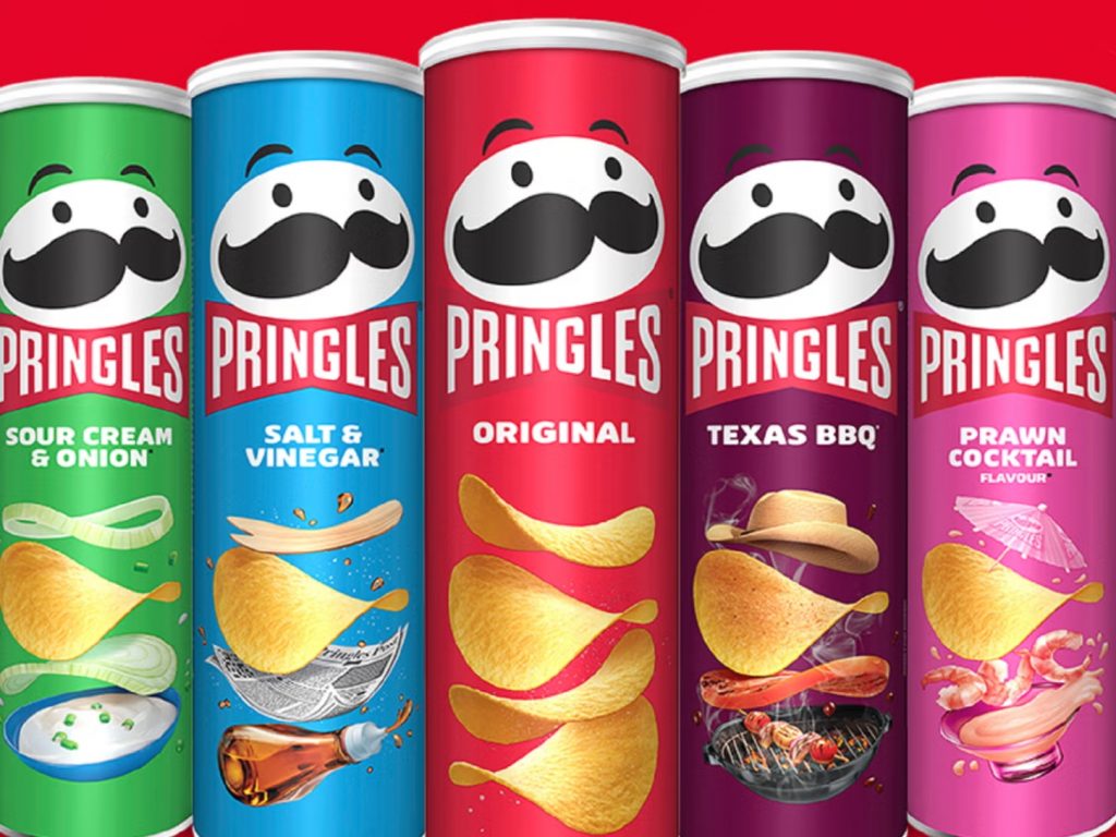
Pringles changed the snack game with its tall cylindrical box, not just to protect the chips, but to stand out.
4. Texture and Touch Create Memory
Even in the digital age, texture matters. Whether it’s a matte finish, embossed lettering, or a recyclable kraft paper feel, the tactile element of packaging contributes to how it’s remembered and shared. Think of texture as a silent communicator. What should the box feel like? Sleek? Rustic? Soft?
Sensory memory is powerful. A package that feels good in the hand tends to linger longer in memory. Try mixing textures – a smooth base with a foil logo – to elevate the design and make it feel premium.
High-end smartphones often come in matte black boxes with soft-touch finishes to signal quality.
5. Storytelling Creates Emotional Connection
People buy with emotions first, logic second. Packaging that tells a story – through images, copy, or layout – taps into this. Include storytelling elements in your packaging design. Can you use icons to trace the product journey? Can a simple illustration say more than a paragraph?
Packaging with a narrative gives customers something to relate to. Whether it’s the founder’s journey, ingredients sourced from a local farm, or a design inspired by heritage art – stories sell. Make sure the design reflects that narrative consistently.
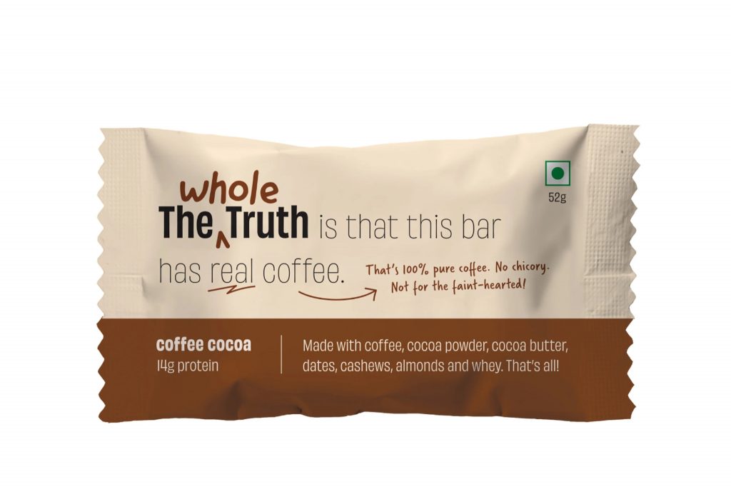
‘The Whole Truth Foods’ uses transparent storytelling, cheeky copy, and clear ingredient breakdowns on their packages to make customers feel informed and connected.
6. Transparency Builds Trust
Trust is currency in today’s market. Transparent packaging or honest labeling shows customers you have nothing to hide. It’s a key ingredient in customer loyalty and brand authenticity. Packaging with see-through windows that reveal the actual product inside, or minimalist designs that avoid overwhelming claims. It can also be verbal — using honest, straightforward language to list ingredients, sourcing details, or brand values.

Minimalist, a modern Indian skincare label, uses clean, black-and-white packaging and honest ingredient descriptions to reflect a commitment to clarity and efficacy. Their direct tone builds credibility and consumer loyalty.
At ARCH, we believe great design begins with understanding people. Our curriculum blends psychology, user behavior, sustainability, and aesthetics to help students design for real-world impact. Whether it’s product packaging, branding, or digital design, students gain hands-on experience in dedicated labs, prototyping studios, and collaborative workspaces.
With expert mentors, cutting-edge facilities, and industry exposure, we prepare aspiring designers to create products that are both beautiful and purposeful. If you’re passionate about the power of design to influence, inspire, and innovate, this is the place for you. To know more, contact us today.
